
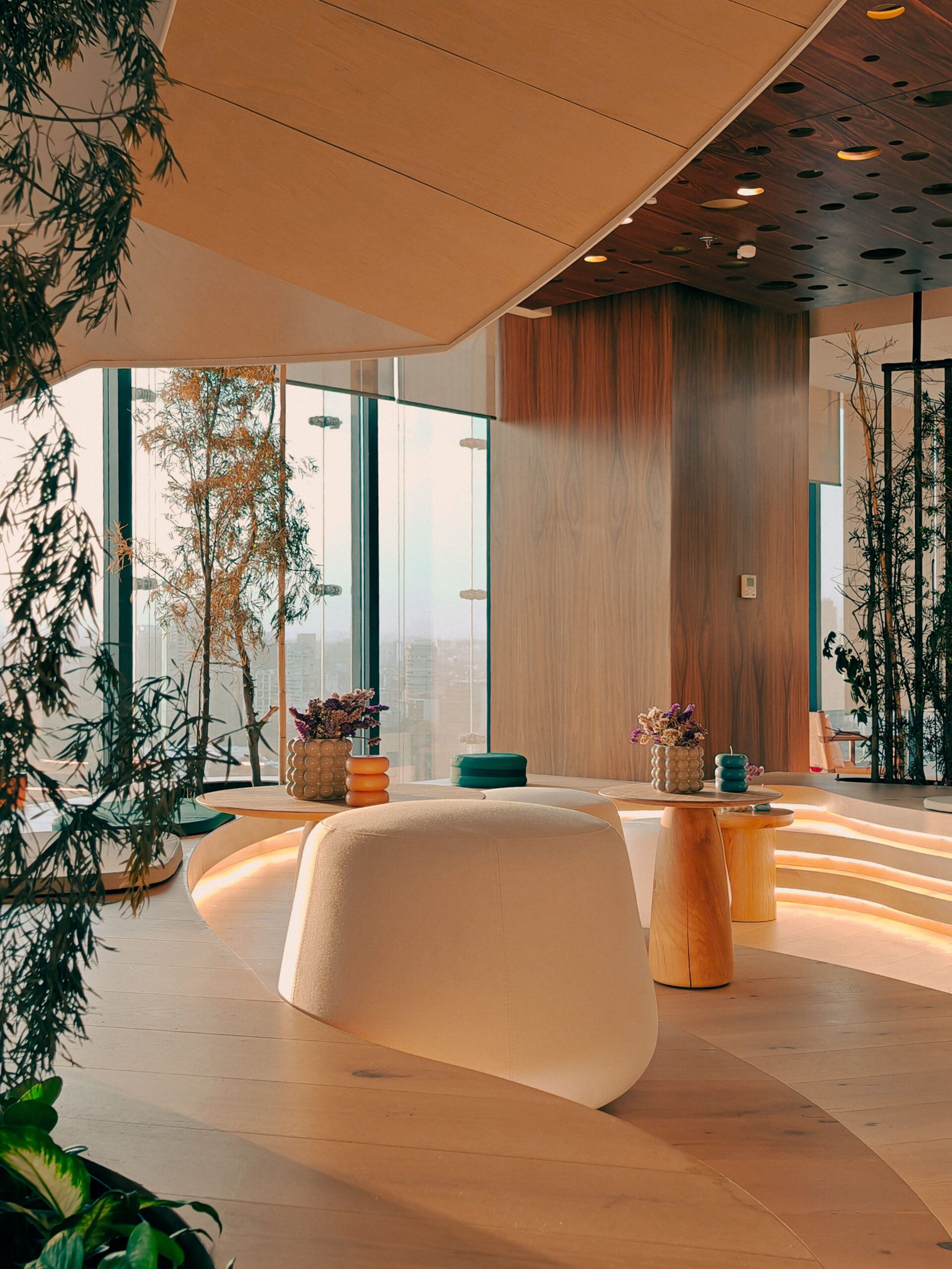
How colour influences perception, relaxation and the feeling of comfort
Colour is often treated as the final decorative layer of a room: something chosen after the furniture, lighting and materials have already been defined. In reality, it is one of the first elements we perceive when entering a space.
Before we consciously notice a chair, a work of art or an architectural detail, colour has already shaped our initial impression. A room may appear calm, intimate, spacious, energetic or sophisticated partly because of the palette surrounding us.
Understanding the psychology of colour does not mean following a rigid set of rules. The emotional effect of a shade depends on its intensity, brightness, temperature, surrounding materials and the way it interacts with natural and artificial light. Personal memories and cultural associations also influence how we respond to it.
The most successful interiors therefore use colour not simply to decorate a room, but to support the way people are meant to feel and live within it.
Warm and cool colours: creating atmosphere
Warm colours such as red, terracotta, orange and ochre tend to make a space feel more stimulating, welcoming and intimate. They can bring energy to social environments such as dining rooms, kitchens and shared living spaces.
However, intensity matters. A vivid red wall can become visually dominant, while a muted clay or rust shade may create warmth without overwhelming the room. Softer versions of warm colours are often easier to introduce through textiles, artwork and smaller design details.
Cool colours—including blue, green and certain shades of violet—are commonly associated with quieter, more restorative atmospheres. They are frequently used in bedrooms, bathrooms and reading areas where relaxation is important.
Yet a cool colour does not automatically make a room feel peaceful. A highly saturated electric blue can feel energetic, while a soft grey-blue may appear gentle and contemplative. The character of the colour is determined as much by saturation and brightness as by the hue itself.
The role of neutrals
Neutral interiors are often associated with simplicity and comfort, but neutral does not have to mean colourless.
Warm whites, sand, stone, taupe and soft beige can create a sense of visual continuity, allowing architectural details and natural materials to become more prominent. These tones can also make a space feel timeless and adaptable.
Cooler neutrals, including pale grey and crisp white, may communicate clarity and modernity. When used without contrasting materials, however, they can sometimes make an interior feel impersonal.
Texture is particularly important in neutral spaces. Wood, linen, wool, ceramic and natural stone add depth and prevent a restrained palette from becoming visually flat. Even when colours remain subtle, variations in material and surface can make the environment feel layered and inviting.
How colour changes the perception of space
Colour can also influence how we perceive the dimensions of a room.
Light shades tend to reflect more light and can make an interior feel open and airy. Darker colours absorb more light and often create a greater sense of enclosure. This does not mean that small rooms should always be painted white. Deep colours can transform a compact room into an intimate, immersive environment when used intentionally.
The placement of colour matters too. A darker ceiling may visually lower a very tall room, making it feel more balanced. A coloured feature wall can draw attention towards a specific area, while using a consistent shade across walls, doors and architectural details may create a more seamless visual effect.
Rather than trying to make every room appear larger, good interior design considers the atmosphere the space genuinely needs. Sometimes intimacy is more desirable than openness.
Designing for relaxation and comfort
In spaces intended for rest, visual balance is usually more important than selecting one supposedly calming colour.
Soft contrasts, harmonious combinations and moderate saturation can reduce visual tension. Bedrooms may benefit from gentle greens, mineral blues, warm neutrals or muted earth tones, but the final choice should respond to the room’s light and to the person using it.
Colours also change throughout the day. A beige wall may appear warm and golden in the morning but cooler under artificial evening light. For this reason, paint samples should always be observed in the actual room at different times before a final decision is made.
Comfort also comes from familiarity. A colour connected to a positive memory, a landscape or a meaningful place may feel more reassuring than a shade selected only because it is currently fashionable.
Creating a personal colour palette
A well-designed palette usually begins with the purpose of the room.
Should the space support concentration, conversation, rest or creativity? How much natural light does it receive? Which materials are already present? These questions are often more useful than starting with a trend.
One practical approach is to choose a dominant base colour, a secondary tone and a smaller accent shade. Repeating these colours through furniture, textiles, artwork and decorative objects creates continuity without making the room feel overly coordinated.
Ultimately, colour works best when it reflects both the function of a space and the identity of the people inhabiting it. The goal is not to create a universally perfect interior, but an environment that feels emotionally coherent.
When chosen with intention, colour becomes more than decoration. It helps define how a room is perceived, how it is remembered and, most importantly, how it feels to live there.
Explore collaboration opportunities with Zayra Living. We welcome selected collaborations with brands, destinations and design-led spaces aligned with our editorial vision.
For partnership enquiries, contact hello@zayraliving.com